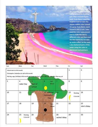
This is my calendar for September. My theme is basically world land marks. September was Brazil and Brazil is known for their beaches. So I edited a beach. To edit this picture, I used the color replacement tool to make the sand a different color and then used the blur tool to try to make an ombre effect on the sand. I also darkened parts of the water using the color replacement tool and burn tool. Brazil's land mark is the Jesus on a mountain so then I used the magnetic lasso tool and traced around the Brazilian god on a separate page. Then I moved it onto here. From there I used the brighten tool to make the statue a white color instead of a gray. From there, I positioned it onto a rock. After that I just free hand a palm tree on paint and pasted it on the bottom. Finally, I inserted calendar dates and moon phases.
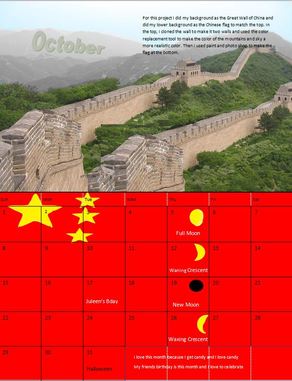
For October, I did my background as the Great Wall of China and did my lower background as the Chinese flag to match the top. In the top, I cloned the wall to make it two walls and used the color replacement tool to make the color of the mountains and sky a more realistic color. Then I used paint and photo shop to make the flag at the bottom.
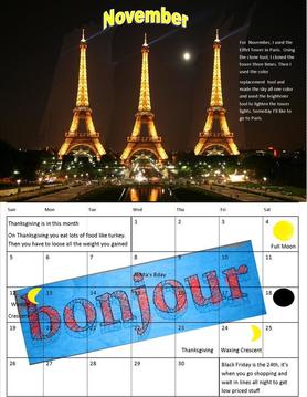
For November, I used the Eiffel Tower in Paris. Using the clone tool, I cloned the tower three times. Then I used the color
replacement tool and made the sky all one color and used the brightener tool to lighten the tower lights. Someday I’ll like to go to Paris.
replacement tool and made the sky all one color and used the brightener tool to lighten the tower lights. Someday I’ll like to go to Paris.
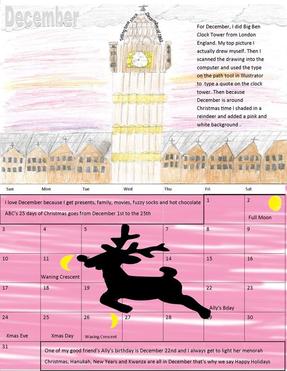
For December, I did Big Ben Clock Tower from London England. My top picture I actually drew myself. Then I scanned the drawing into the computer and used the type on the path tool in Illustrator to type a quote on the clock tower. Then because December is around Christmas time I shaded in a reindeer and added a pink and white background .
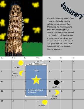
This is of the Leaning Tower of Pisa for Janurary. I designed the background by painting the background black. Then I used the mixer brush and drew stars. Following that, I inserted the tower. Using the hard opaque paint brush, I painted on green grass and traced over the tower in a brown color to make it look grainy and old. Then I used the type on the path tool and inserted a caption. For the bottom, I made a passport since you need a passport to go to Italy
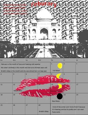
For February, I designed the Taj Mahal. I made a bubble like background because I learned how to use the style tools and I casted shadows over the building and made everything black and white. Then I made kiss marks the background on the bottom because there's a legend that if you kiss someone in front of here then your relationship will last for your life time. One thing I could of done better is fade the background to make it easier to see my caption since it's hard to see.
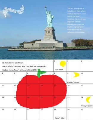
This is a photograph of Lady Liberty from when I went to New York. I used this for March and because it was my own photograph I didn't have to do much editing. I took this on the ferry, however, the photo was originally dark so I learned how to do the brightening tool and I made a little bit of a reflection on the water. For the bottom, New York is known as the big apple so I painted an apple
